Handling lazy-loaded image reflows in Shopify themes
Lazy loading images is a pretty common practice nowadays, why load all images on each page if you can't garuantee your users will actually see them? To prevent your users from downloading every image, you can instead load all images which are visible/close to being visible within the users browser viewport as they scroll.
There's a ton of libraries in the wild which implement lazy loading functionality, I'd reccomend to do some research and choose one that fits your needs or even roll your own. The only assumption I'll make here is that your markup for a lazy-loaded image looks something like this:
<img data-src="//domain.com/image.jpg" alt="" />
This image will only load when it's visible/close to being visible within the users browser viewport.
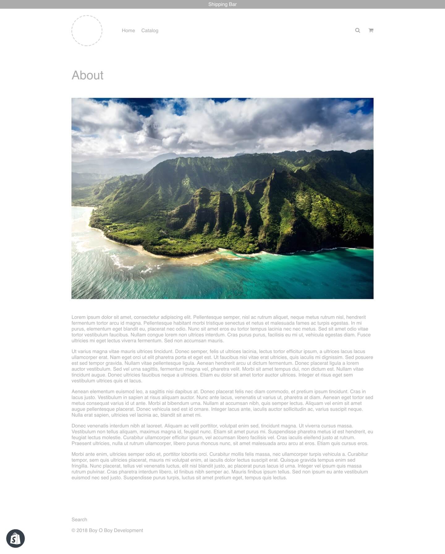
Here's a screenshot of the page we'll be building:
The content will be fed from a Section:
{% schema %}
  {
    "name": "About",
    "settings": [
      {
        "type": "text",
        "id": "title",
        "label": "Title"
      },
      {
        "type": "image_picker",
        "id": "image",
        "label": "Image"
      },
      {
        "type": "richtext",
        "id": "copy",
        "label": "Copy"
      }
    ]
  }
{% endschema %}

{% assign title = section.settings.title %}

{% assign image = section.settings.image %}
{% assign image_url = image | img_url: '2000x' %}

{% assign copy = section.settings.copy %}

<h1>
  {{ title }}
</h1>

<img data-src="{{ image_url }}" alt="" />

<div class="rte">
  {{ copy }}
</div>
Here's a video of this page loading on a fast 3G connection:
Notice how initially, the copy text is visible, then once the image has loaded, the content reflows and the text gets pushed out of view underneath the image. This happens due to the browser having no knowledge of the image prior to it loading, including the image width and height.
We're working with a Shopify "image" object here which provides extra info about the image, including it's width and height; if we have access to this info prior to downloading the image in the browser, we can work out it's aspect ratio like so:
{% assign image_box_ratio = image.height | append: ".0" | times: 1 | divided_by: image.width | times: 100 | append: "%" %}
From there, you can wrap the image in a container which uses this aspect ratio:
<div style="--box-ratio: {{ image_box_ratio }};">
  <img data-src="{{ image_url }}" alt="" />
</div>
Sprinkle in some CSS:
[style*="--box-ratio:"] {
  height: 0;
  padding-bottom: var(--box-ratio);
  background: #F8F8F8;
}
The Section will look like this:
{% schema %}
  {
    "name": "About",
    "settings": [
      {
        "type": "text",
        "id": "title",
        "label": "Title"
      },
      {
        "type": "image_picker",
        "id": "image",
        "label": "Image"
      },
      {
        "type": "richtext",
        "id": "copy",
        "label": "Copy"
      }
    ]
  }
{% endschema %}

{% assign title = section.settings.title %}

{% assign image = section.settings.image %}
{% assign image_url = image | img_url: '2000x' %}
{% assign image_box_ratio = image.height | append: ".0" | times: 1 | divided_by: image.width | times: 100 | append: "%" %}

{% assign copy = section.settings.copy %}

<h1>
  {{ title }}
</h1>

<div style="--box-ratio: {{ image_box_ratio }};">
  <img data-src="{{ image_url }}" alt="" />
</div>

<div class="rte">
  {{ copy }}
</div>
With that in place, the loading experience has dramatically improved:
Notice how the image is displayed as an empty placeholder (grey) box before the image is actually downloaded, once the image has loaded, there's no content jump because the grey box uses the same aspect ratio as the image itself.
I use this method throughout all Shopify sites I build and work on, it's such a huge performance boost with very minimal effort.
What about images which aren't "image" objects?
It's quite common to have theme references to image URLs instead of "image" objects when you use metafields to store data via a metafield editor app. Depending on the app, this method is still possible with a bit of tweaking - I make use out of Accentuate Custom Fields when I need resources to have non-global section data (e.g. each collection needs a different hero image).
While Accentuate supports an "image" field type, it's impossible for it to return an actual "image" object due to the limiations of metafields; it just returns an image URL:
{{ collection.metafields.accentuate.hero_image }}
Will return an image URL like:
https://cdn.accentuate.io/69262540870/4651314610246/image.jpg?2000×1334
This URL contains the image width and height in the query paramters; we can take advantage of this to calculate it's aspect ratio like this:
{% assign image_url =  collection.metafields.accentuate.hero_image %}
{% assign image_url_width = image_url | split: "?" | last | split: "x" | first | times: 1 %}
{% assign image_url_height = image_url | split: "?" | last | split: "x" | last | times: 1 %}
{% assign image_url_box_ratio = image_url_height | append: ".0" | times: 1 | divided_by: image_url_width | times: 100 | append: "%" %}
We can then use it like this:
<div style="--box-ratio: {{ image_url_box_ratio }};">
  <img data-src="{{ image_url }}" alt="" />
</div>